




Two-tone kitchens are an increasingly popular choice for home cooks, offering a sophisticated way to add depth, personality, and visual flair to the heart of your home. Whether you are looking to ground a large open-plan kitchen or add a sense of height to a compact layout, exploring two-tone kitchen ideas offers endless creative potential.
Recent search data reflects this growing interest, with the term ‘two-tone kitchen’ reaching peak popularity throughout the first quarter of 2026. This surge is accompanied by breakout searches for specific ‘two-tone kitchen cabinet ideas’ and ‘contrasting kitchen units,’ suggesting that homeowners are moving away from monochrome layouts in favour of more expressive, multi-layered designs.
If you are beginning your renovation journey, visiting your local Kutchenhaus showroom is the best way to see how these textures and tones interact in person. Seeing our new kitchen colours, such as the contemporary Macchiato and Stone Blue, alongside deeper, earthier tones, helps you visualise how a bespoke contrast can transform your own space.

Why Two-Tone Kitchens Are Leading the Way
A two-tone kitchen uses two different colours or materials for the cabinetry, worktops, or focal points like islands. This approach breaks up the visual weight of the room, making it feel more dynamic and less like a standard installation. It's a design technique that allows you to play with the architecture of the space, using colour to draw the eye exactly where you want it.

Are Two-Tone Kitchens Hard to Pull Off?
They don't have to be. The secret lies in balance. We recommend the '60-30-10' rule: 60% of your dominant colour (usually the lighter tone), 30% of your secondary contrast colour, and 10% for accent details like handles, lighting, or bar stools. This ensures the room feels cohesive rather than chaotic.

Exploring Two-Tone Kitchen Cabinet Ideas
The most popular way to introduce this trend is through your kitchen units. Mixing contrasting kitchen cabinets allows you to experiment with bold colours without the risk of overwhelming the space.
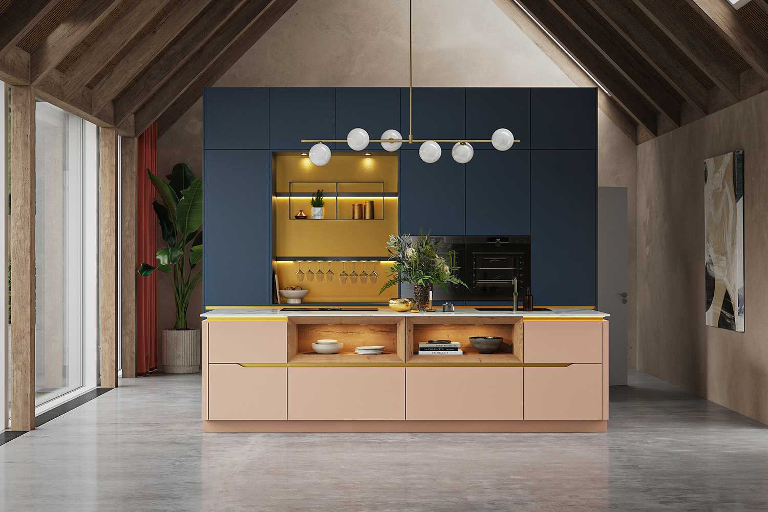
Contrasting Kitchen Units: The Rule of High and Low
A classic approach is to use a darker shade for the base units and a lighter tone for the wall-mounted cupboards. This is particularly effective in smaller kitchen designs where a dark colour used throughout might feel restrictive.
For a contemporary look, consider pairing our new Stone Blue on the base units with a neutral tone like Alpine White above. The blue provides a calm, grounded feel that works beautifully in both modern and traditional settings, while the lighter top units ensure the room remains flooded with light.

Tall Units and Accent Framing
Another sophisticated method is to use a different colour for your floor-to-ceiling tall units or pantry cupboards. This makes the kitchen feel more like an extension of your living space.
Using a textured wood finish, such as Sierra Oak, against a smooth lacquer finish like Stone Grey creates a tactile contrast that feels premium and thoughtfully designed. This approach works particularly well when the tall units are recessed into a wall, creating a seamless, architectural look.

The Focal Point: Contrasting Kitchen Islands
If you aren't ready to commit to two different cabinet colours across your entire layout, a contrasting kitchen island is the perfect middle ground.
By choosing a statement shade for the island that differs from the perimeter units, you create an immediate focal point. This is often where we suggest using our bolder palettes to add character:
Bold Pairings: A deep Fjord Blue or a rich Rust Red island surrounded by neutral Grey Slate cabinets creates an aspirational and timeless aesthetic.
Modern Sophistication: Combining neutral Taupe cabinetry with a striking Graphite Black island offers a sleek, industrial-inspired contrast that feels incredibly current.
Anchor the Space: Using a darker tone on a central island helps to ground the room in large, open-plan living areas.

Contrasting Kitchen Island Countertops
Don't stop at the cabinetry. A contrasting kitchen island countertop can further elevate the design. Pairing a dark marble on the island with a simpler, matte surface on the perimeter worktops adds a layer of luxury and creates a strong focal point.
This variation in surface texture serves several purposes:
- Visual Distinction: It helps to distinguish the social hub of the island from the functional working areas of the kitchen.
- Texture Play: Mixing a polished stone with a matte cabinet finish creates a tactile experience that feels premium.
- Balanced Weight: A lighter perimeter worktop keeps the room feeling bright, while a dramatic island surface acts as an attractive, design-led element.

What Colours Work Best for Two-Tone Kitchens?
Choosing the right pairing is key to ensuring the space feels harmonious rather than cluttered. While personal taste is paramount, certain combinations have a proven track record for longevity and style.
- Navy and White: A classic pairing that offers a nautical, clean aesthetic.
- Green and Oak: For a warm, rustic feel that still feels modern, pair Mineral Green with natural wood textures.
- Macchiato and Stone Blue: For a contemporary twist, pair the warm, earthy beige of Macchiato with the cool, refined depth of Stone Blue.
- Black and Timber: For a high-contrast, industrial-inspired look, matte black units paired with honey-toned oak provide a striking, sophisticated finish.

Beyond Cabinets: Contrasting Worktops and Backsplashes
To truly master the trend, look at your horizontal surfaces. Contrasting kitchen worktops can be used to delineate the prep zone from the social area. You might choose a durable, heat-resistant ceramic for the main cooking run and a warmer, more tactile timber for the breakfast bar area.
Similarly, a backsplash that matches your secondary cabinet colour can help tie the whole design together. A continuous splashback that flows from the worktop up the wall is a key trend for 2026, providing a seamless look that showcases German engineering at its best.
Final Design Tips for your Two-Tone Kitchen
- Consistent Hardware: Keep your handles and taps in the same finish (e.g., brushed brass or matte black) across both tones to maintain a sense of cohesion.
- Lighting Matters: Use under-cabinet LED lighting to highlight the transition between your two chosen colours.
- Sample Everything: Colours can shift dramatically depending on the natural light in your home. Always view your chosen finishes in a Kutchenhaus showroom before making a final decision.
At Kutchenhaus, we pride ourselves on crafting kitchens that are as practical as they are beautiful. Our design experts are ready to help you navigate these bold colour choices, ensuring your new kitchen reflects your personality while standing the test of time.
Visit one of our showrooms or book an online design appointment to start your Kutchenhaus journey!
Next Steps…

Showroom appointment

Online appointment
